Craigslist Redesign and UX Design
This is an independent project where I decided to redesign Craigslist with the goal of making it safer for people to use. The objective of the design was to let people be aware of people who are dangerous on the site, the site does this by providing a user satisfaction rating to show how well that user provides their items. To increase safety there's a message box so users don't have to provide their contact information to strangers and to create a post you must provide a valid I.D. The pages below are the homepage, create a post page, and 2 created posting examples. I also made this design with Adobe XD to fully flesh out the user experience portion of a website.
You can test the prototype of the website at the link below.

Craigslist Redesign home page showing recommended items and recently viewed items
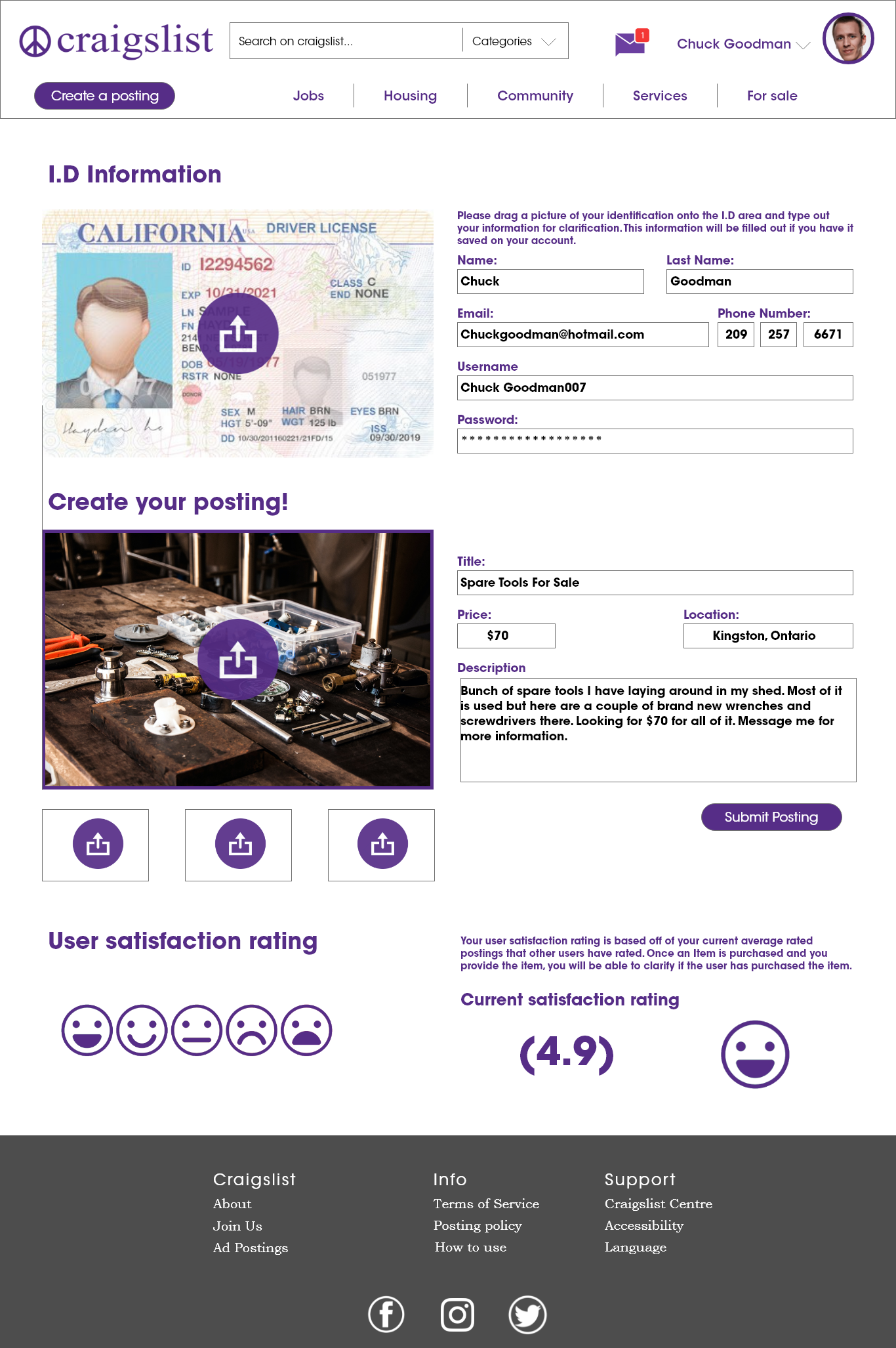
Craigslist Redesign create post page showing how to make a post on the new site, this also showcases the user satisfaction rated system
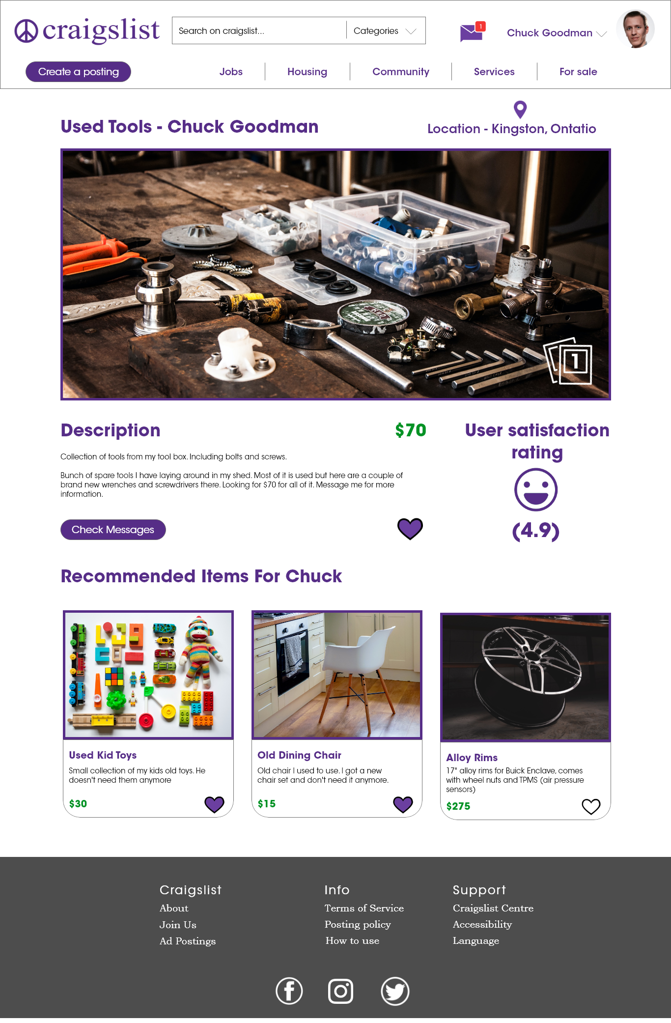
This is an examples of what the page will look like after you create a page.
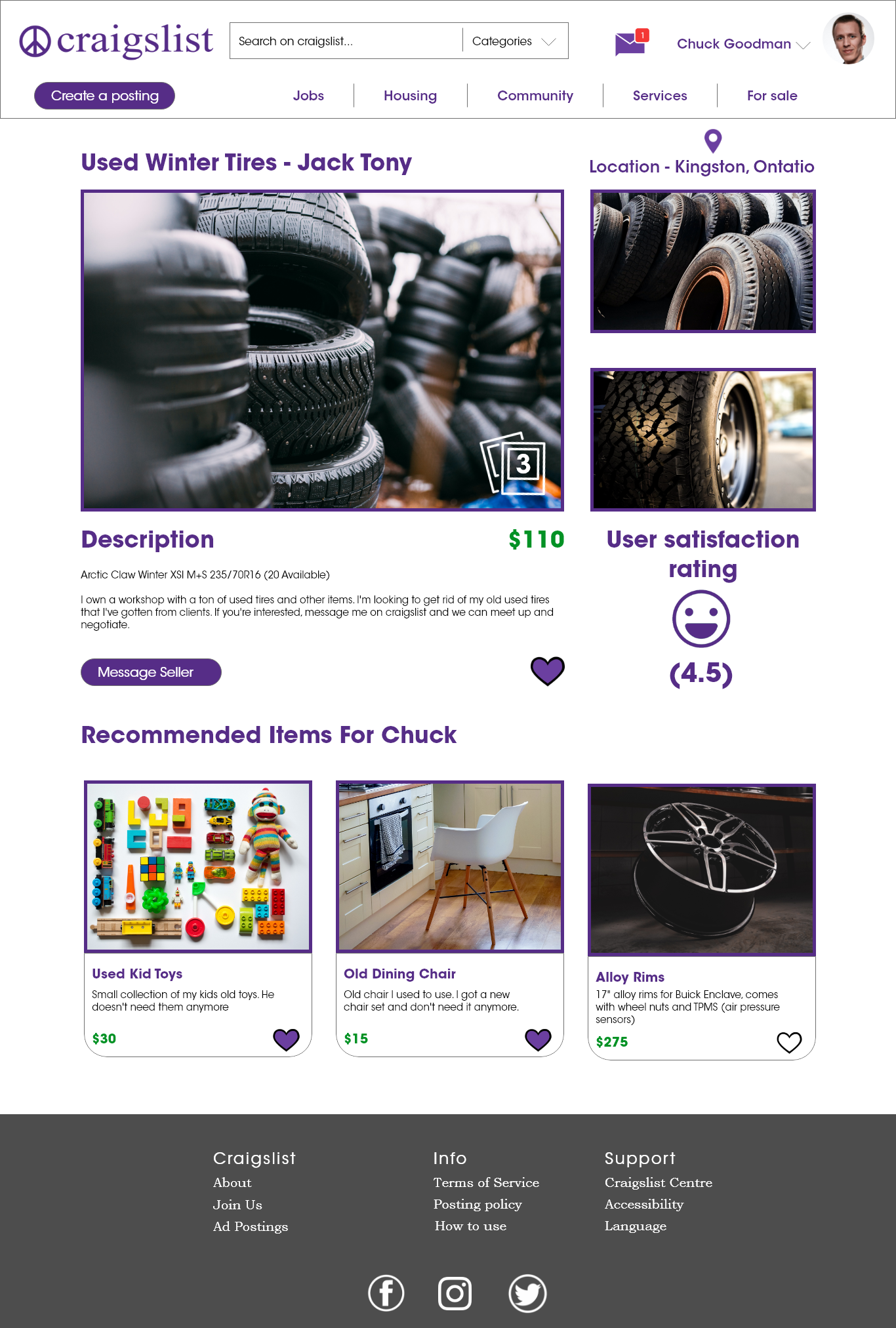
This is an example of what viewing someone else's page will look like
PickedToday Client Design
This webpage was a task given to me by a client, and my job was to create the layout of the webpage and use the style guide created by a team of designers to help be consistent with their brand. My main goal with this layout was to add a recipe page to help bring in new customers by showing them what they could do with microgreens, while also piquing the interest of the existing customers. The pages below are the home page, recipe page, and product page.
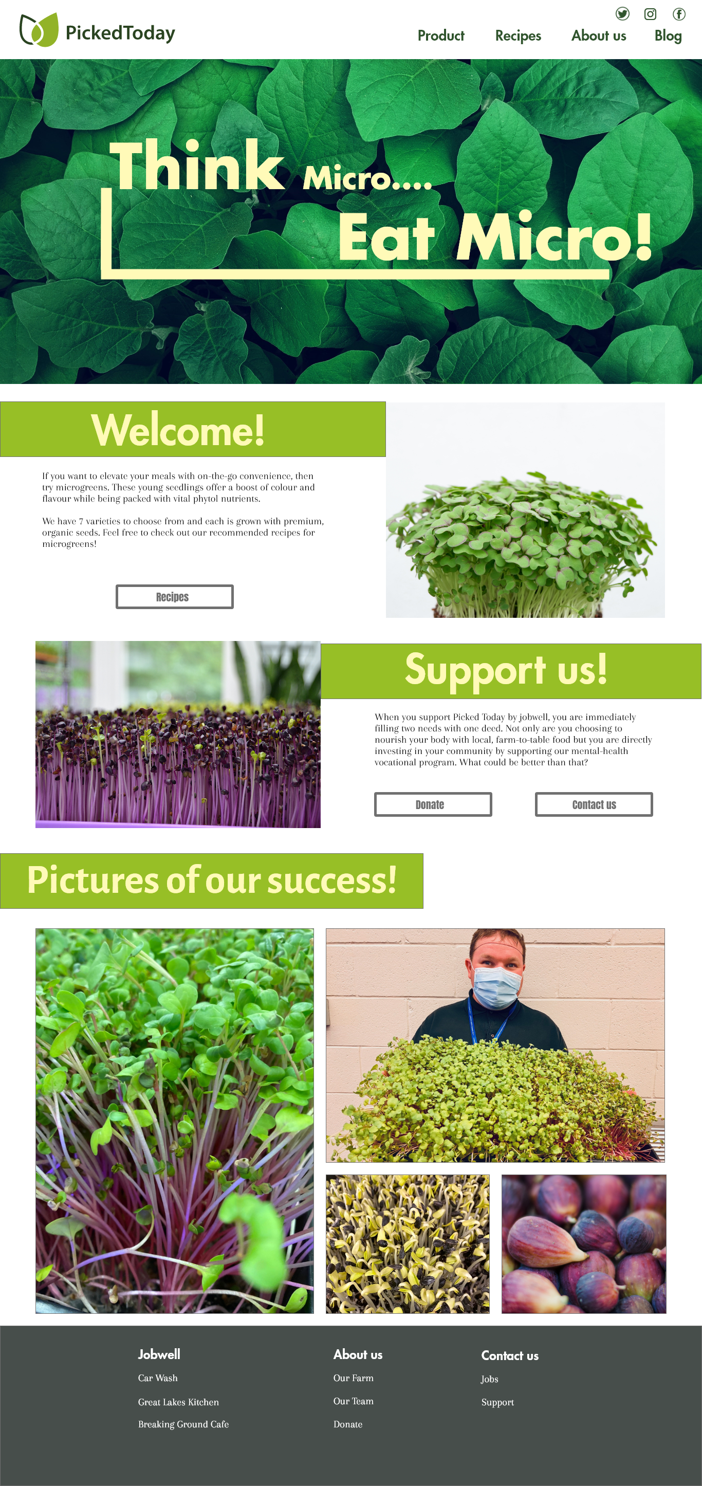
Home page of the PickedToday client project showcasing microgreens and the companies successes
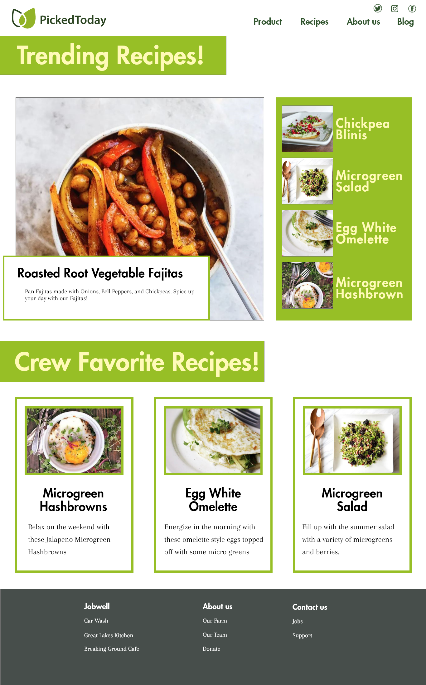
Recipe page showcasing what can be done with Microgreens

Product page, showing all the available products you can buy at PickedToday
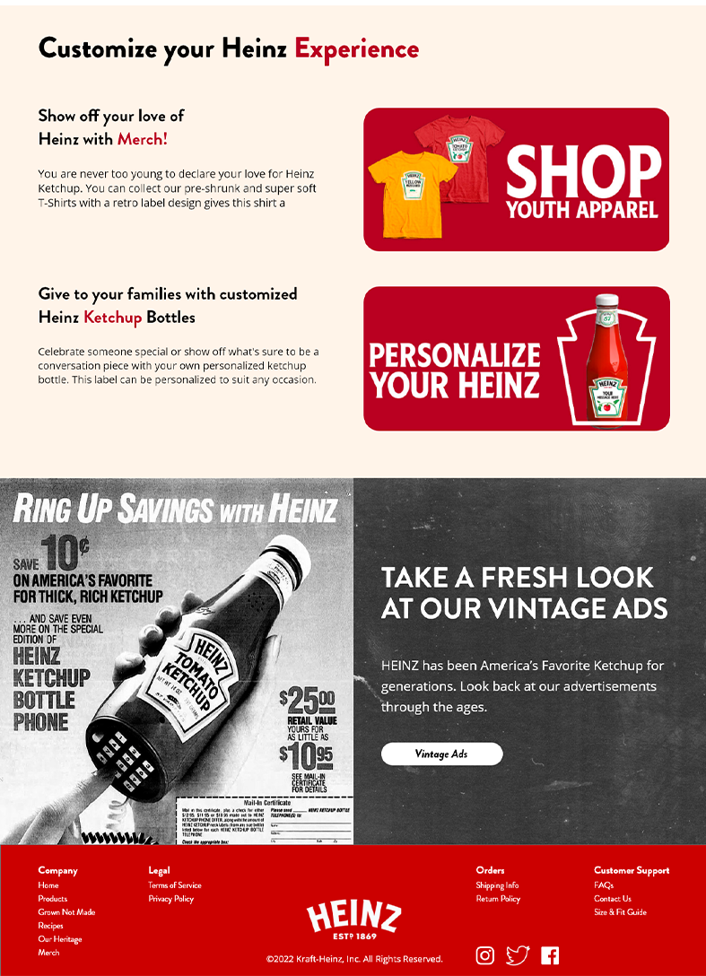
Heinz Redesign
I challenged myself to redesign a homepage of an established brand to bring excitement to an underdeveloped website. The original website showed no content on the home page, so I showcased other points of the website on the homepage to grab the viewer. I'm quite fond of the colour pallet of the site, it jumps out to the reader without being too overpowering towards the text.
This web design was created in Adobe XD for quick layout creation.